
I used this to figure out transitions using react router:step-by-step guide of simple routing transition effect for react with react router v 4
so I spent time making a background for my app. I thought this would be an easy process and read about how to set a background with inline styles also this, set background in react js using style And finally made something that looked like this and worked alright;
import leaves from './leaves.png';


const styles = theme => ({
  root: {
    display: 'flex',
    flexWrap: 'wrap',
    justifyContent: 'space-around',
    overflow: 'hidden',
    backgroundColor: theme.palette.background.paper,
    backgroundImage: `url(${leaves})`,

  },
and I put this in my gridlist component because as I was styling the thing I realized it did have a background image, that white grid.
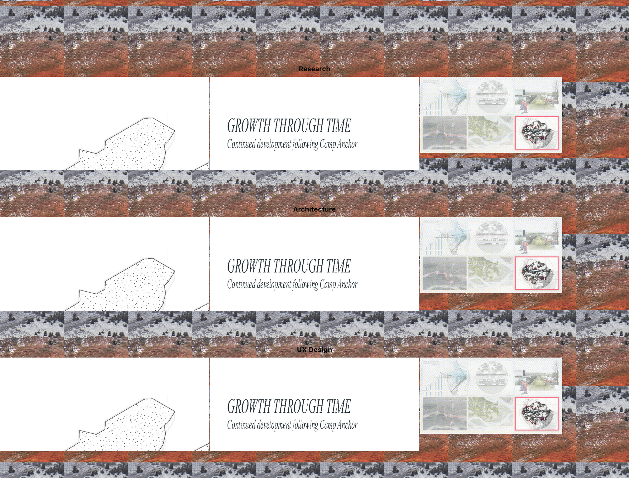
I also added a few other gridlists to give the sectioned look to the gridlist my client wanted. I added h1's to label these sections things like 'research' and 'archetecture' just as placeholders.
function ImageGridList(props) {
  const { classes } = props;

  return (

    <div className={classes.root}>
      <GridList cellHeight={450} className={classes.gridList} cols={3}>
        {gridlistData.map(tile => (
          <GridListTile key={tile.img} cols={tile.cols || 3}>
            <Link to={tile.link}><img src={tile.img} alt={tile.title} /></Link>
          </GridListTile>
        ))}
      </GridList>

      <h1>Research</h1>

      <GridList cellHeight={450} className={classes.gridListKid} cols={3}>
        {gridlist2Data.map(tile => (
          <GridListTile key={tile.img} cols={tile.cols || 3}>
            <Link to={tile.link}><img src={tile.img} alt={tile.title} /></Link>
          </GridListTile>
        ))}
      </GridList>

      <h1>Architecture</h1>

      <GridList cellHeight={450} className={classes.gridListKid} cols={3}>
        {gridlist3Data.map(tile => (
          <GridListTile key={tile.img} cols={tile.cols || 3}>
            <Link to={tile.link}><img src={tile.img} alt={tile.title} /></Link>
          </GridListTile>
        ))}
      </GridList>

     <h1>UX Design</h1>

      <GridList cellHeight={450} className={classes.gridListKid} cols={3}>
        {gridlist4Data.map(tile => (
          <GridListTile key={tile.img} cols={tile.cols || 3}>
            <Link to={tile.link}><img src={tile.img} alt={tile.title} /></Link>
          </GridListTile>
        ))}
      </GridList>
    </div>

  );
}

ImageGridList.propTypes = {
  classes: PropTypes.object.isRequired,
};

export default withStyles(styles)(ImageGridList);
...I struggled a bit to figure out how to make the gridlist batch of 6 show up fully, while having to scroll down to reveal the gridlist batches of 3. I realized this was a matter of what height I made each gridlist batch and eventually got it right, where my full screen is filled by the batch of 6 and then I can scroll down a reasonable amount and see the other separate batches of gridlist. (see gridlist pic 1 and 2 for an illustration.)
I had to change the batch of 6 to some weird little white square of a picture because the origional images I was using were just too big and adding the other batches of gridlist below it was making my browser crash. As long as I have the placeholders I need and general functionality of the pink border hover and links that go to project details working, I can size the images I need later and add them in.
![[paper clip]](/cours/static/images/paper_clip_tilt.png)
| last modified | size | ||
 |
Screen_Shot_2019-03-02_at_2.24.45_PM.png | Sat Jun 13 2026 09:11 am | 5.4M |
