
I'm considering using something called plotgraph to make my first two home components move. I read this stuff about cinemagraphs but didin't end up using it. this youtube video about making a still photo animate with photoshopis going to be extremely useful and something I intend to try in the near future. plotaverse is the thing i got a membership to and I think this might also offer an easy way to animate still photos.
I had problems like the text not wrapping in the p tag and I think I fixed that using this in the css. I tried inserting a line break and I don't think that worked and I ended up using this:
.about{
        display:flex;
        background-image:url('../scenes/navbar/images/texturesky.png');
        background-size:contain;
    }
    .abouttext{
        display:flex;
        justify-content: center;
        word-break: break-all;
        white-space: normal;
        margin-top:11em;
        color:gray;
        padding:4em;
        font-size:.8em;
    }

.textdiv{
    display:flex;
    height:50em;
    width:30em;
    background-color:white;
    justify-content: center;
    width:33em;
    margin-left:7em;
    }
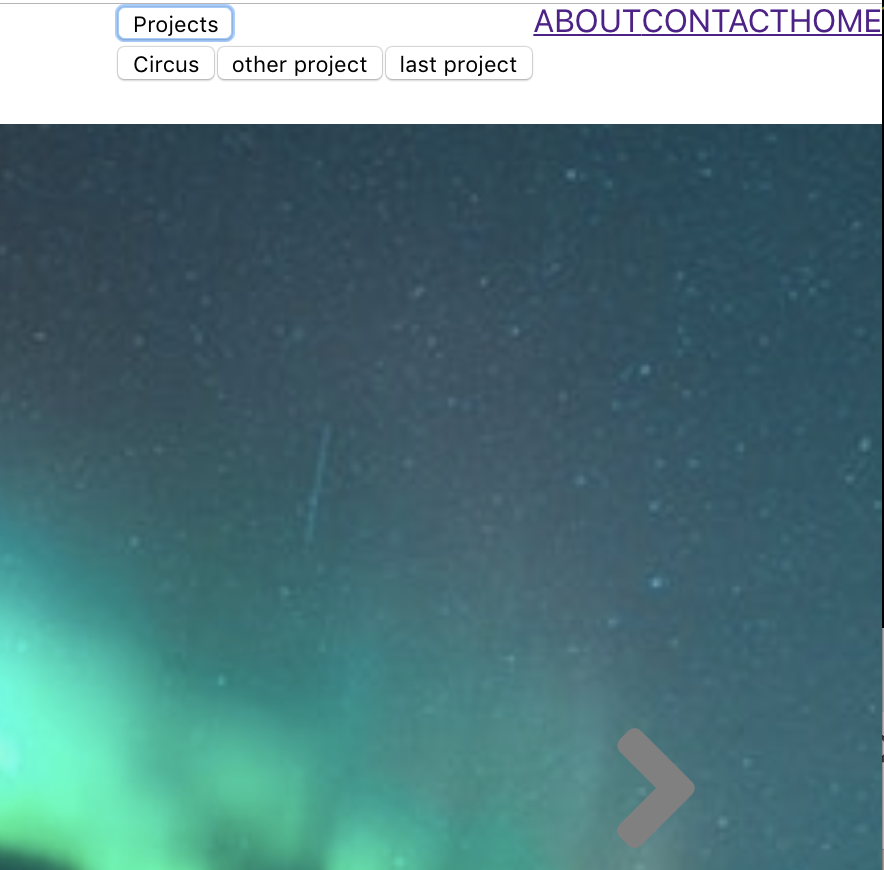
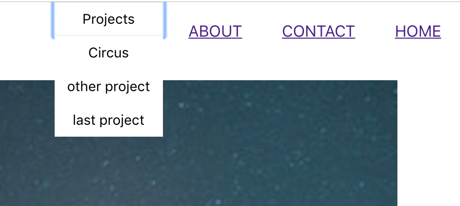
I also had trouble layering my components and looked at this about the stacking context particularly the navbar and I believe this was solved using
.navbar{
    display:flex;
    justify-content: flex-end;
    background-color:rgba(246,248,248,.9);
    z-index:-1000;
    margin-bottom:-1.32em;
I had to make the navbar slightly opaque and read things like this to try and figure it outand ended up doing this;
.navbar{
    display:flex;
    justify-content: flex-end;
    background-color:rgba(246,248,248,.9);
which is setting opacity with rgba.
there were lots of weird default margins so I read this about removing themparticularly had a gap between navbar and header and managed to get rid of it using a margin-bottom.
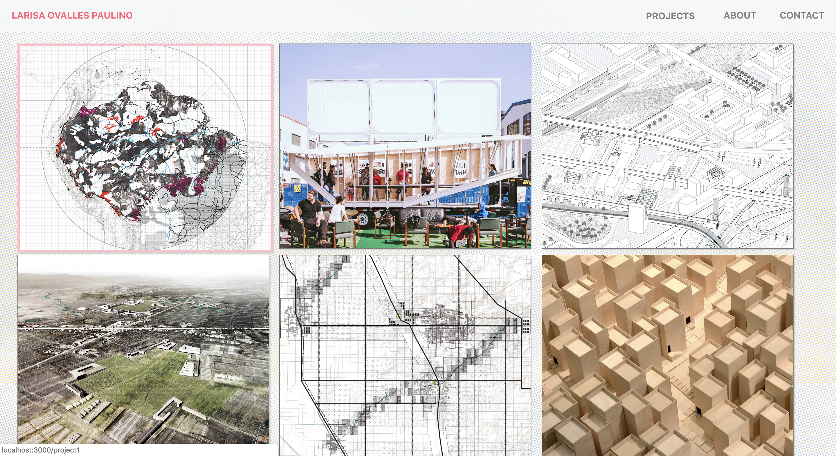
I started having tremendous problems with the gridlist. I started reading things like this about lining things up with flexbox to try and solve the problemto 'to use flex to evenly distribute the extra available width of the div box as margin between the images'. there were a lot of styles being imported because I Used this material ui gridlist and I ended up paying for every minute using this stupid thing saved me. I studied inline styles in jsxto see what powerful ways I might find to override some of the styles being sent over by material ui. I was getting really desperate and trying to override the user agent stylesheet using the !important command and thats the only thing that made it possible for things like this to work over the material ui styles
gridListKid:{
    width: 5000,
    height: 555,
    marginTop: '-189px !important',
},

gridListKid2:{
  width: 5000,
  height: 555,
  marginTop: '-110px !important',
}
I particuarly had trouble with each gridlist segment because their li's were auto generated depending on how many columns you indicated you wanted made. below is a single gridlist with a certain number of columns:
<GridList cellHeight={450} className={classes.gridList} cols={3} >
        {gridlistData.map(tile => (
          <GridListTile className='omg' key={tile.img} cols={tile.cols || 3}>
            <Link to={tile.link}><img src={tile.img} alt={tile.title} className="gridimgs" /></Link>
          </GridListTile>
        ))}
      </GridList>
I had to be careful to call them 'gridlist', 'gridlistkid', 'gridlistkid2' to make sure I could differentiate between the li's and uls auto-generated.
of course I read the gridlisttileapi looking for hints about overriding these styles but coulden't figure anything out.
eventually did figure it out and could focus on more secondary details of style like the background and different ways of setting that as an inline jsx style vs just in css and then the difference between importing a local file vs using a hotlink, and the different ways to position background images. I think I do it differently in almost every component.
heres how i do it in gridlist:
import texturesky from './images/gridlistbackground/texturesky.png';


const styles = theme => ({
  root: {
    display: 'flex',
    flexWrap: 'wrap',
    justifyContent: 'space-around',
    overflow: 'hidden',
    backgroundColor: theme.palette.background.paper,
    backgroundImage:`url(${texturesky})`,
backgroundSize:'75%',


  },
the above is an inline style, but heres what i put in the css for the about page:
.about{
        display:flex;
        background-image:url('../scenes/navbar/images/texturesky.png');
        background-size:contain;
    }
added cute details like a box shadow using this link to finish up the gridlist once I got it to behave(see picture below).
and other details such as the navbar opacity without messing up other things.
![[paper clip]](/cours/static/images/paper_clip_tilt.png)
| last modified | size | ||
 |
Screen_Shot_2019-03-04_at_8.19.45_AM.png | Sat Jun 13 2026 09:16 am | 579K |
|
Screen_Shot_2019-03-04_at_9.46.03_AM.png | Sat Jun 13 2026 09:16 am | 190K |
|
Screen_Shot_2019-03-14_at_11.31.44_PM.png | Sat Jun 13 2026 09:16 am | 9.1M |
