
I’ll give a summary of my first 6 hours or so of Wordpress work. I created a thing, arranged it, could not make it less ugly at a certain point, so started looking for ways to make a Wordpress site look less cookie-cutter and found some interesting resources. I think this will represent my Wordpress journey in a nutshell.
I started working on a Wordpress website for lace curtains. Started with the basics, uploading photos and arranging them using the plug-in beaver builder. I haven’t read any more specific documentation yet because I wanted to mess around with it on my own and see how far I could get without having to labor over minutia. I suspected I’d be able to get pretty far without reading, and I was right.
Basically, I figured out how to get all the formatting stuff in more or less. However I learned that to make Wordpress websites look truly customized, one must spend hours tweaking and fiddling and forcing it to do what you want. It’s going to take a combination of graphic-artistry studies, minute attention to some css, as well as some handy tricks and learning about plugins to get exactly every effect I’d want to have. This will be my challenge in this tutorial and I’m excited for it.
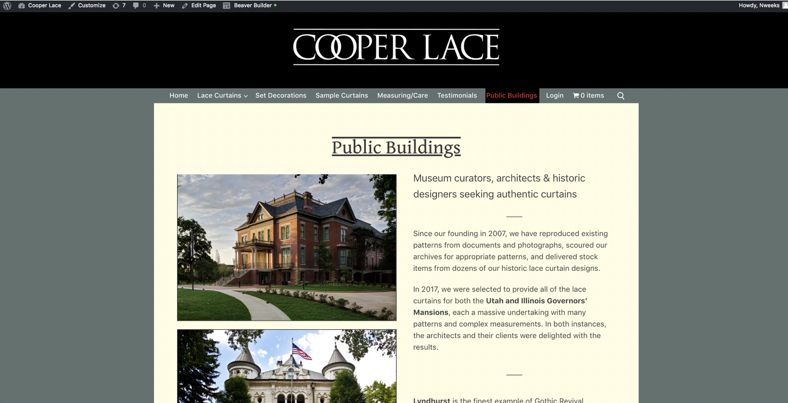
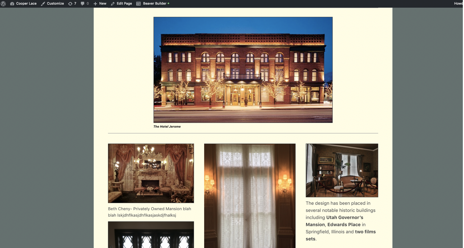
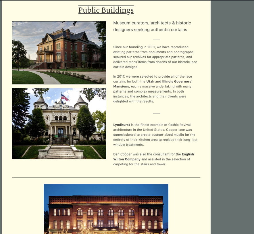
For now I simply arranged photos in a way I thought was most aesthetically appeasing. Originally this had been a page full of text and images so I rearranged everything for a few hours, did what I could do without reading, and it looks like Image 1 (see below). Image 1 shows the top half, I put in a vector file “cooper lace” because the PDF image I was using was fuzzy and I read somewhere that vector files are resizable. I played around with the css and figured out how to add in text edits so gave public buildings double lines. I messed around with smaller lines and page-breaks to make the text look better(see image 2)
There were lots of photos and the tricky part was figuring out how to get them lined up in a way that was both professional and pleasing to the eye. I moved things around dozens of times, finally settling on the idea that I simply don’t need to include every photo if the shape was not right or all the text no matter how impressive it made things sound. I have even more photos to upload and try and separate out into something that looks halfway professional. I put a higher view of the final layout of the top half, image 3.
Again, I learned less is more, and originally this was all a jumbled heap so I need to read about visualizations and how to lay out photos on the page so they are pleasing to the eye.
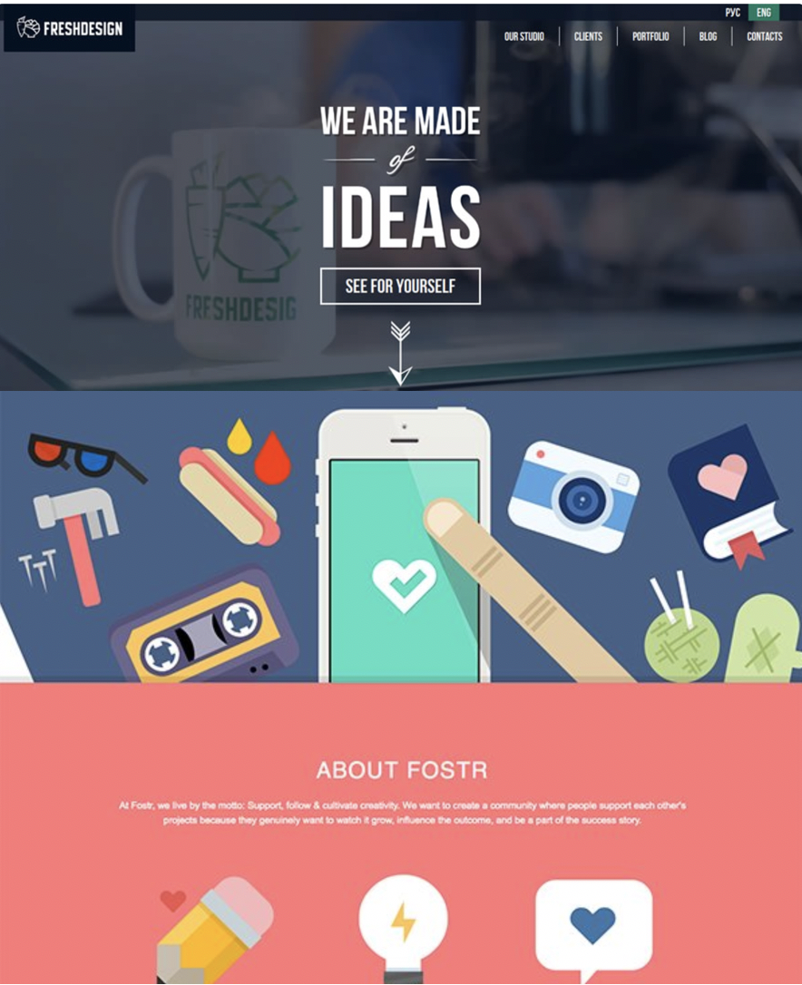
I started reading about minimalist design here:Minimalist Web Design Examples
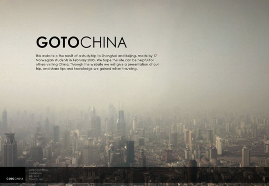
and it made me realize how horrible my website looks, so I’m going to look into making it more intricate with background colors, background photos, different textures, all the while simplifying the content as much as possible. Here are some photo examples from what I read, I’d like my stuff to look this good eventually(see images 4-5)
I also looked up the top 10 Wordpress sites out there and the results were pretty impressive. “the Obama foundation” was pretty and gave me good ideas for a sidebar rather than my current navbar. “the Houston zoo” also had a pretty website that took advantage of Wordpress’s natural blocky-ness in implementing their layout, putting pictures side-by-side like bricks and going for more of a flat theme. These sites actually didn’t look so different from any other React website, so it’s something to aspire to and tells me that a quality interface is possible: Top Ten Wordpress Sites
![[paper clip]](/cours/static/images/paper_clip_tilt.png)
| last modified | size | ||
| Image1.png | Tue Jul 28 2026 12:33 am | 967K | |
| Image2.png | Tue Jul 28 2026 12:33 am | 1.5M | |
| Image3.png | Tue Jul 28 2026 12:33 am | 730K | |
| Image4.png | Tue Jul 28 2026 12:33 am | 1.3M | |
| image5.png | Tue Jul 28 2026 12:33 am | 886K |
